


Most maintenance dashboards are graveyards of good intentions. Somebody built them during a CMMS rollout, they looked impressive in the demo, and now they sit on a shared drive getting opened once a quarter when finance asks about uptime. The charts are technically accurate. They're also useless — not because the data is wrong, but because nobody can point to a single decision that changed because of them.
That's the real failure mode. A KPI that doesn't drive a decision is decoration. And in maintenance, decoration is expensive — the time spent building that dashboard was time not spent on the two or three numbers that actually move mean time between failures or protect the budget.
This article is about fixing that at the root — treating maintenance KPIs data governance as an actual system, not a reporting afterthought. The reason most dashboards fail isn't the visualization layer. It's the messy work-order and asset data underneath, combined with the habit of measuring what's easy instead of what's actionable.
Vanity metrics vs. actionable metrics: the distinction nobody enforces
There's a pattern that shows up in almost every facility team that's been running a CMMS for more than a year: the dashboard is packed with numbers that feel important but can't be acted on.
Total work orders completed this month. Great — but completed how? A tech closing 40 low-priority filter swaps looks identical to a tech resolving 40 emergency HVAC calls. Average time-to-close sounds useful until you realize it collapses emergency, preventive, and corrective work into one meaningless blob. Percentage of PMs completed on time is fine until you notice half of them were "completed" by a tech tapping done from the parking lot.
The test for whether a metric is actionable is embarrassingly simple, and most teams skip it: If this number gets worse next week, do I know exactly what I would do about it? If the answer is "look into it," it's a vanity metric. If the answer is "reassign the two overdue safety PMs on Line 3 and check why the compressor keeps generating repeat calls," it's actionable.
| Metric | Why it feels useful | Why it usually fails | Actionable version |
|---|---|---|---|
| Total WOs completed | Shows activity | No weighting by priority or type | Completed WOs by priority band, split PM/CM/emergency |
| Average time-to-close | Feels like efficiency | Averages hide the outliers that hurt | Time-to-close by asset criticality, with p90 not mean |
| % PMs on time | Compliance-friendly | "On time" ≠ done well | On-time PMs with completed checklist + parts logged |
| Overall uptime | Executives love it | Too aggregate to act on | Downtime by asset, ranked by cost-per-hour |
| Backlog count | Simple | Doesn't show risk | Backlog aged by priority + safety flag |
The right column is harder to build. That's exactly why most teams stay in the left column. But the left column never changes anyone's Tuesday.
Why this breaks — and it almost always starts in the data
You can't build actionable metrics on top of data nobody trusts. And in most facilities, the underlying work-order and asset data is quietly broken in ways that don't surface until you try to slice it.
Eliminate downtime with proactive maintenance.
Openfixit helps you plan, track, and complete maintenance efficiently—maximizing asset reliability.
- Centralized asset management
- Automated maintenance scheduling
- Inventory and parts tracking
No credit card required
-
Free-text everything. Failure codes, asset names, problem descriptions — all typed by hand, all inconsistent. "AHU-3," "Air Handler 3," "ahu3," and "roof unit" are the same asset, and your dashboard counts them as four.
-
Missing asset linkage. Work orders logged against a location or a building instead of a specific asset. Now you can't calculate cost-per-asset, failure frequency, or anything that requires knowing what actually broke.
-
Downtime that isn't captured. The tech knows the chiller was down six hours. The CMMS shows a work order opened at 2pm and closed at 2pm because that's when it got entered. Your MTBF is fiction.
-
Labor hours that don't reconcile. Estimated vs. actual hours diverge wildly, or actuals just aren't logged at all, so any cost or efficiency metric is guesswork.
Bad data doesn't announce itself. The dashboard still renders. The chart still has a line on it. The number is still a number. Nobody realizes it's garbage until they make a decision based on it and it backfires — like cutting PM frequency on an asset that looked reliable only because half its failures were logged against the wrong equipment.
This usually happens because data entry standards were never enforced at the point of capture. Every tech invented their own shorthand, the CMMS accepted all of it, and a few years later you have a dataset that's technically full and functionally empty.
What breaks at scale
At one site, sloppy data is survivable. A supervisor who's been there fifteen years just knows that "roof unit" means AHU-3, and knows the boiler actually fails more than the records suggest. Tribal knowledge patches over the data gaps.
That model collapses the moment you add sites, add technicians, or lose that supervisor to retirement.
Across a multi-site portfolio, the inconsistencies compound. Site A codes failures one way, Site B another, and suddenly you can't compare them. Leadership asks "which site has our worst-performing chillers?" and the honest answer is "we can't tell, because the data isn't comparable." So someone builds a dashboard anyway, picks whatever fields are populated across all sites, and produces a comparison that looks authoritative and means nothing.
This is where the coordination problem becomes a governance problem. When maintenance data feeds budgeting, capital planning, and compliance reporting, one team's loose data-entry habits become another team's bad decision. Finance defends a capex request using failure data that was never validated. A compliance report cites PM completion rates that included drive-by closeouts. The error propagates outward, and by the time it surfaces, it's four departments removed from the tech who typed "fixed" into a description field.
Local data problems become organizational decision problems the moment the data leaves the person who understood its flaws.
Fixing the foundation before you touch the dashboard
You cannot report your way out of a data problem. The order of operations matters, and most teams get it backwards — they build the dashboard first and then wonder why it's wrong.
-
Pick the decisions first, then the metrics. Don't start with "what can we measure?" Start with "what decisions do we make repeatedly, and what would help us make them better?" PM interval adjustments, repair-vs-replace calls, staffing allocation, spare-parts reorder timing. Each of those needs specific data. Everything else is noise.
-
Trace each decision back to required fields. A repair-vs-replace decision needs accurate cost-per-asset, which needs asset linkage, labor actuals, and parts costs all tied to the right equipment. Now you know exactly which fields have to be clean. You don't have to fix everything — just the fields that feed real decisions.
-
Enforce standards at the point of capture. Dropdown failure codes instead of free text. Required asset selection before a WO can close. Downtime captured as start/stop timestamps, not entry time. This is where technician workflow design matters more than any reporting tool.
-
Backfill and reconcile the critical fields only. You will never fully clean three years of history, and you don't need to. Clean the fields tied to your priority decisions, for your critical assets, going back as far as your decisions actually require.
-
Validate against reality before publishing. Before a metric goes on a live dashboard, someone who knows the floor should sanity-check it. Does the "most reliable asset" list match what the techs believe? If not, the data's lying — and you found it before leadership did.
Only step five involves anything you'd call a dashboard. The first four are data governance. That ratio — roughly 80% foundation, 20% presentation — is the part nobody wants to hear, and the part that separates dashboards that get used from dashboards that get ignored.
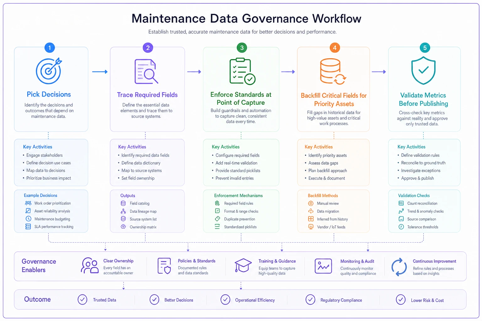
This workflow summarizes the sequence from decisions to a published dashboard.
Dashboard blueprints tied to actual decisions
Once the foundation holds, the dashboards almost design themselves — because you built them around decisions instead of around whatever charts looked good in the demo.
The PM optimization view. For each critical asset: PM frequency, corrective work orders generated between PMs, parts and labor cost of the PM program, and failures. The decision this drives is simple — are we over- or under-maintaining? If an asset gets a monthly PM and generates almost no corrective work, you're probably over-servicing. If it gets quarterly PMs and keeps failing, you're under-servicing. That's a real Tuesday decision, backed by a chart that points directly at it.
The reliability triage view. Assets ranked by downtime cost per hour, not just downtime count. A conference-room thermostat failing weekly is annoying. A production chiller failing monthly is a budget event. Ranking by cost-weighted impact tells you where the reliability engineering effort should actually go — and stops the team from chasing whatever squeaked loudest last week.
The backlog risk view. Not a count. Backlog aged by priority, with safety and compliance items flagged separately. The decision: what do we schedule this week to keep aging safety work from becoming a violation? A raw backlog number of "230 open work orders" tells you nothing. "Four safety PMs overdue by 20+ days" tells you exactly what to do before you leave the office.
The labor allocation view. Hours by work type — planned vs. reactive — trending over time. When reactive work creeps above roughly 40–50% of total hours, your PM program is losing the fight. That ratio shift is one of the earliest reliable warnings that a facility is drifting toward firefighting mode.
The thread running through all of these: the chart exists to trigger a specific action, and if you can't name that action, the chart probably shouldn't exist.
A real scenario
A three-site light manufacturing operation had a CMMS dashboard with fourteen KPIs on it. Impressive to look at. In practice, the maintenance manager was still making PM and staffing calls off gut and a spreadsheet he kept on the side, because he didn't trust the dashboard — and he was right not to.
The core problem: a significant portion of work orders weren't linked to a specific asset, and failure descriptions were all free text. Any metric that required knowing which asset failed was quietly wrong. Uptime looked fine at the portfolio level while two chillers at the newest site were failing repeatedly, buried under location-level logging.
They didn't rebuild the dashboard first. They spent about six weeks tightening data capture — mandatory asset selection at close, a short dropdown list replacing free-text failure codes, and downtime captured as actual start/stop times. They backfilled asset linkage only for their top roughly 40 critical assets rather than trying to fix everything at once.
Then they cut the dashboard from fourteen KPIs down to five, each tied to a named decision. Within a couple of months, the cost-weighted reliability view surfaced the two problem chillers immediately — something the old dashboard had hidden for over a year. Reactive labor share, which had been sitting around 55%, dropped into the low 40s over the following quarter once PM intervals were adjusted using data the manager finally trusted. The spreadsheet on the side disappeared. That was the truest sign it worked.
When a big dashboard overhaul is the wrong move
Not every team should stop and rebuild. A few honest caveats:
When it makes sense: You're feeding maintenance data into budgeting or compliance, you run multiple sites, or you're about to make capital decisions based on failure history. In those cases, bad data is a liability and the governance work pays for itself.
When it's a bad idea: You're a single small site where the supervisor genuinely knows every asset and every quirk. Formalizing everything into dashboards you'll never look at is busywork. Fix data capture quietly, skip the dashboard theater.
Who should not do this yet: Teams mid-CMMS-migration. Don't build decision dashboards on data you're still moving and validating — you'll bake the migration's inconsistencies into metrics people start trusting. Get the foundation stable first.
The system view
The whole thing is one connected chain: a technician's data entry feeds the work-order record, the work-order record feeds the asset history, the asset history feeds the metric, the metric feeds the decision, and the decision feeds the budget. Break any link and everything downstream is quietly compromised — but the dashboard keeps rendering like nothing's wrong, which is exactly what makes it dangerous.
Good maintenance KPIs data governance isn't a reporting project. It's the discipline of making sure that chain holds from the tech's phone all the way to the capex request. The teams that get this right don't have prettier dashboards. They have fewer numbers, cleaner inputs, and a clear answer to the only question that matters when a metric moves: now what do we do about it?
Pick three decisions you make every month, work backwards to the data those decisions actually need, and clean only that. The dashboard is the last thing you build, not the first — and once it's built on data your own team believes, it stops being decoration and starts changing what people do on a Tuesday.
Ready to optimize your maintenance operations?
Join 2,000+ facilities using Openfixit to reduce unplanned outages, extend asset life, and improve operational efficiency.